New Logo and Brand Identity for Comperio
Today we are launching a new brand identity for Comperio. As of now we are stronger, prouder and more clear on what we are: search evangelists!
A year ago the Comperio Design Team started with planning and researching for what today has resulted in a new brand identity. It includes a new logo, new branding of services and products, more colors in our color palette, the redesign of our offices in Oslo, Stockholm, London and Boston, and Comperio employees who proudly hand out their new business cards.
The research we did in advance of the rebranding was threefold:
- A simple analysis of what didn’t work with the existing profile, how we used the logo and the logos we are being seen next to.
- An internal survey to uncover Comperio employees’ thoughts about “who we are”.
- Data collection from materials featuring those we consider to be the world’s leading brands, to see the characteristics of a brand as “not just a logo” – how the brands use colors, fonts and graphical elements.
The output of this research, was a brief outlining the need for a prouder, stronger, more contemporary logo, with heavy typography and black as the main color. It must be solid and without 3D effects or shadows, and in a sans serif font (such as Arial and Helvetica).
After several directions, sketches and internal meetings, this is our new logo:
A simple typographic logo, with details you do not see until you see it several times, where our new payoff, “Search Matters”, is given the attention it deserves.
This is our color palette:
We have had the orange and cyan color since the birth of Comperio, but the new profile has more focus on black and gray as well. And not least, we have added a new color: purple – that will get us a little less technical, and showcase the valuable creativity we have so much of, among other things, the design team’s resurgence.
Now we are looking forward to show of Comperio in magazines and newspapers, on websites and in social media and at conferences around the world for years to come … And we look forward to with even greater confidence to state that; Search Matters ®!
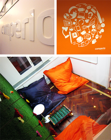
Some glimpses from our rebranded office in Oslo:
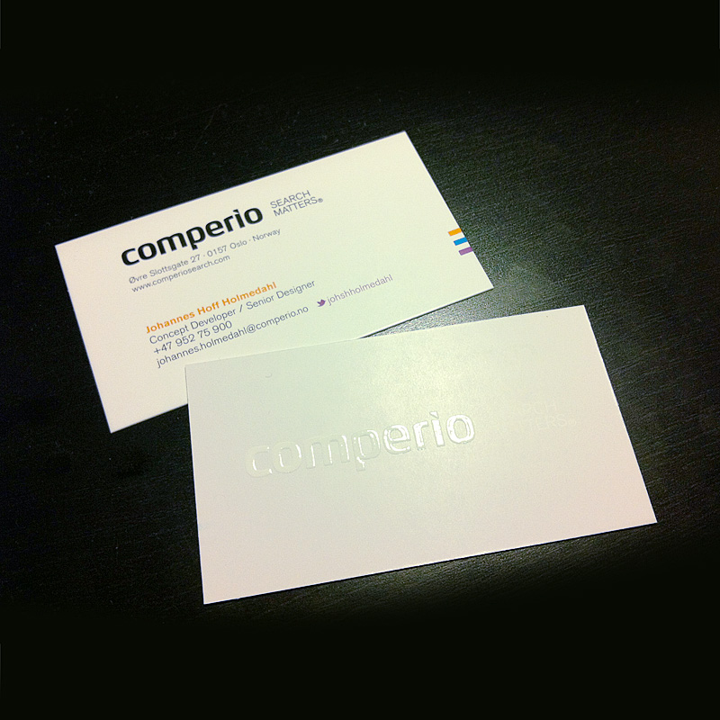
A little bonus material for my fellow design nerds:
This … is my new business card:
A 400 gram coated paper, with 5 four-color printing (purple Pantone color of the Twitter bird to avoid halftone in its beak). The back of the card has a 4-colored light gray (C3 M3 Y4 K0), with white logo, where the logo is raised with relief varnish.
Yes, it’s just a business card … and Jaguar is just a car :-)


