Making logical design attractive
Here at Comperio we love making design logical. But how do we combine logical design with design that is innovative and modern – design that makes your product stand out more than your competitors product?
 First of all: How do we define the term logical design? By logical design we mean graphic design with the user in focus: Design inspired by interaction design that takes the seriously principals of usability seriously – both on screen and paper.
If we say that design is “art”, we can define logical design as “crafts”. Attractive things that at the same time has a purpose, and that is like it is for a reason.
Logical design on a CD leaflet means the design that instantly tells the audience what kind of music they can expect when pressing play. Logical design on a website makes it a no-brainer for the customer to click the right places (thereby enhancing the call-to-action), what is clickable and so on. Logical design on a brand identity is the design that to the greatest extent possible enhances the brand values, without extra confusing visual elements.
But the challenge appears when our customers asks for web design with “an edge” or “a website different to all other websites”. Because with web design in particular, we have our customs and principals:
- Links in blue, underlined text
- The logo at the top left corner
- Obvious clickable submit-buttons
- The main text in black on a white background
- Clear labeling of what site you’re on
- Headline on every site
- and so on …
By now you’re probably expecting me to come up with a solution of how to combine attractive design with logical design. But again I turn again my own headline: Logical design and exciting design are not opposites. Logical design, done the right way, results in happy users and happy customers, because they both can take a look at the design, and say: “Yeah, that’s just the way it should be!”
Logical design is about making good design, without breaking too many of the rules that we know work – just to appear “innovative” and different.
Take a look at a beautiful design made more logical
Examples of websites we consider both pretty and logical to us as users:
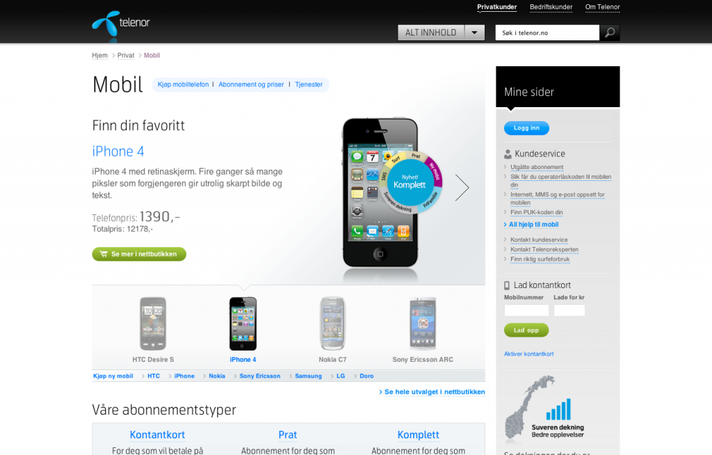
The Norwegian site of the mobile operator Telenor.
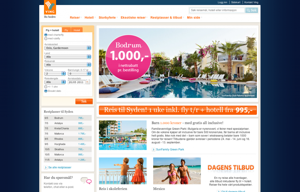
The websites of the Norwegian Travel Operator Ving
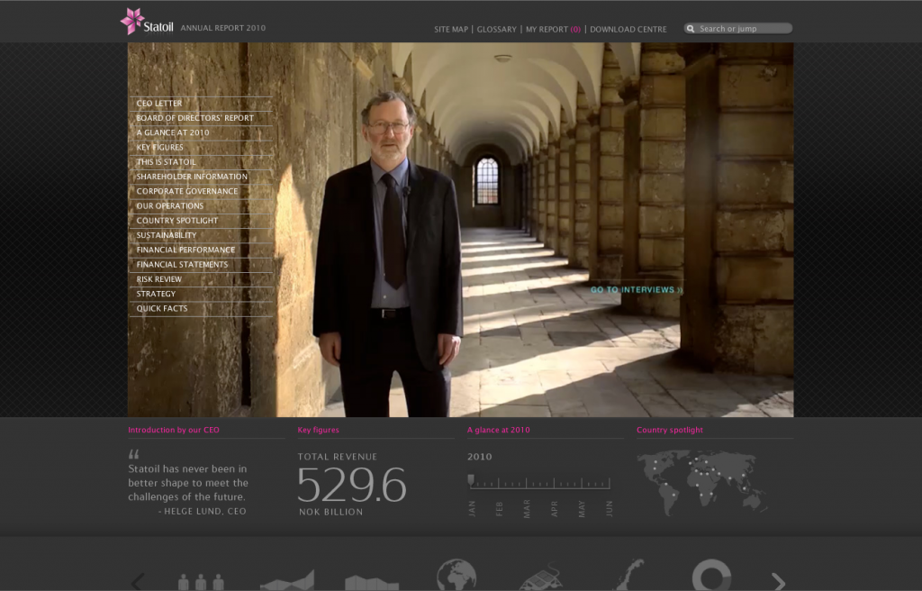
The online Annual Report of Statoil.


[...] Om å gjøre logisk design spennendeJeg er opptatt av å lage det jeg kaller logisk design. Men hvordan kombinerer man logisk design med design som er innovativt og moderne, og som skiller produktet vårt fra konkurrenten? Read this post in English [...]
Problem is that some think design is about “making things pretty”. But design is not what it looks like, it is how it works! And that is Steve Jobs’ words, not mine!