Five quick design improvements to your search design
OK. I know you want it. Quick fixes to make your search results look better. These five points will not give you a perfect or necessarily user friendly search results page … but maybe it will be a bit better than before.
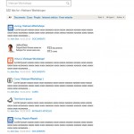
1. Enlarge your search box! Why are you hiding it ? Screenshot: TMZ.com My favorite search box: 2.
|
5 quick fixes for non-designers who want to enhance their search results page:
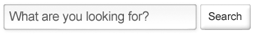
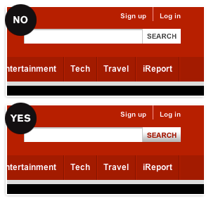
- Enlarge your search box. Almost every second site I see, internal or external, “hides” their search box – maybe because designers think they’re ugly. If you want your people to search: make it easy. I like to add a little gradient on the top of the search box, and to make the corners round. That makes it look inviting to write in.
- Make your search button big and clickable. Make sure the search-button is as tall as your search box, but make it come out of the page, with a clear color or an embossment. The goal is not to make it look cheesy… but to make it look clickable.
- Use already designed material as an inspiration. Make sure that your search results, and the rest of the website for that matter, matches your company brand identity or design hand book. Use the correct colors and fonts – they are probably thought through by a designer already.
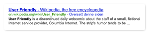
- Use colors familiar to your users. - Blue is for links – Green is for URLs etc. telling visitors where the result came from – Red is for alerts and error messages If your brand identity doesn’t have hex-codes for these colors … ask your designer or design partner for then. Kindly.
- Enlarge your body text size. Many designers tend to user small text in their sketches … maybe to get more room for nice pictures? Your users are probably interested in the result when they are searching, so why don’t we make the text readable. A nice size for a readable body text is 14 og 15px, with a line-height of 17/18 px. Not 12 px Arial…
And a general tip: Don’t try to reinvent the wheel! When working with search design, see how Google, Amazon and Bing format their URLs, links, file type-icons, etc. and make your version of it. Surely you can try another way, but then you should also user test it properly before you launch it.
What are your suggestions to improve search design?