Tiles: the new search result?
100% of the users know they are looking for a document and not a colleague. So why are we showing them both documents and people in the same search result?
A few weeks ago, my colleague Harald and I carried out user interviews at a customer for their “internal Google” solution. Before starting to developing concepts and interaction design, we wanted to properly figure out their users’ actual needs.
One of our findings was that the users generally know the type of content they are looking for. When caseworker Paul searched for “Vietnam Workshops” he knew that it was an application he was looking for – and not a colleague, a PowerPoint file or a news article on the intranet.
Armed with this knowledge, we got some ideas about how to improve their current search experience.
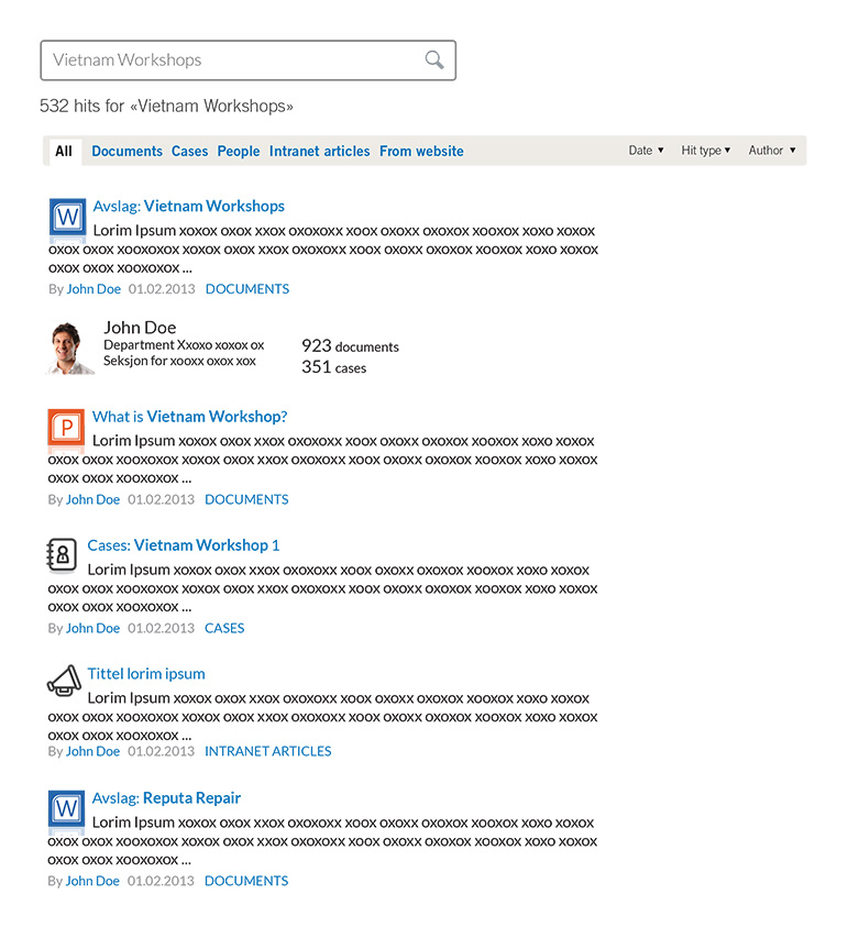
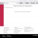
Previously, we thought that this was a good results page when searching for “Vietnam Workshops”:
But maybe this is the way to give Paul a better answer?
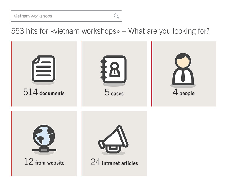
By asking Paul to help us decide on the “search mode” before we begin to guess his answer, we will most likely be able to give him a more accurate result.
However, when we user tested this a few weeks later we received clear feedback that the tiled design left the user feeling a little “cheated”. They had searched, but still needed to make a choice before finding the answer. This is also a well known search pattern – even explained by Monty Python.
Turns out Winnie the Pooh has the answer: “Yes please, I’ll have both” is the solution! The search results present a clear call to action to select a category, but with some results already presented on the first page:
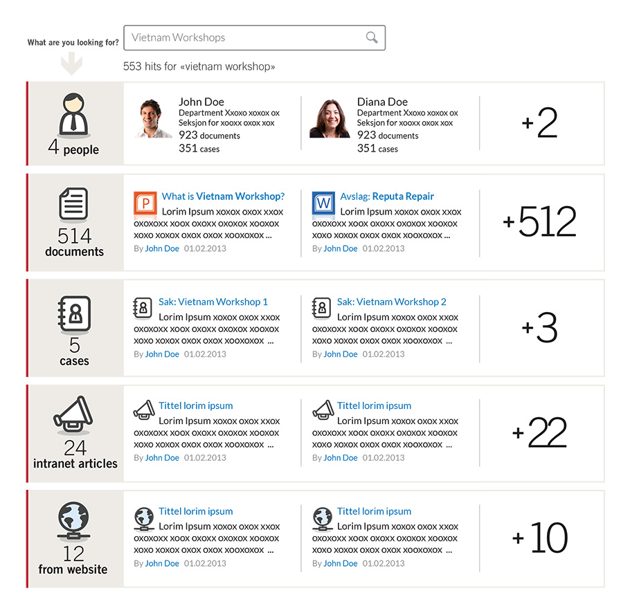
A good argument for displaying results in the various search modes right away is to show Paul that we “know more than what he thinks.” By quickly scanning the results page, he may learn something new about his colleagues, see who’s associated with “Vietnam Workshops”, or maybe he’ll find something interesting in an intranet article; hopefully making his current task simpler and quicker to carry out.
But making it clearer that he has the opportunity to choose a search mode, can help Paul to help us give him a more accurate answer.


Hello Johannes
I think this form of disambiguation to improve relevance really makes sense in the dialogue with the customer; Looking for a vacation a few days ago I noticed the same pattern that made sense to me:
Search for Giglio at Booking.com
Please I need to achieve this in SharePoint 2010 server.
How can I go about it.
Is this hardcoding or a web part.
I will like to implement this for my deployments.
Regards,
Bisi