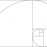
Redesigning Netflix – using the Phi spiral
Last week my colleague, Espen Klem, wrote a post about designing a better search result using a visual relevancy-hierarchy building on the Phi spiral.
I thought I’d test it out.
I decided to use a website that lots of people use – or at least; a kind of page that people could relate to. So I redesigned Netflix’s search result in an hour – using the Phi spiral.
I made the first design, showing the result of a search for the actor Kevin Spacey.
This is the design:

When user testing the design at FiveSecondTest.com the 15 first test results showed me that the design was spot on. Of course, it would be more credible with a lot more tests, but seeing a clear trend in the first ten results often points out how the next 150 results would look like.
This is the result of the first and second clicks:
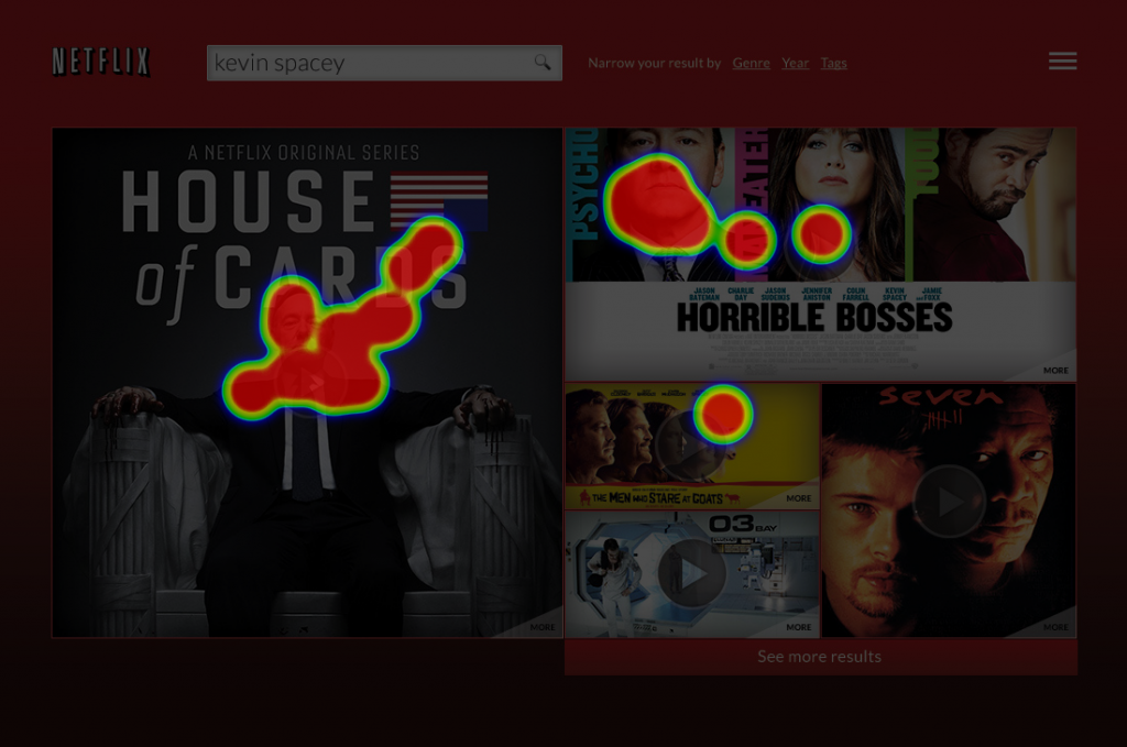
As the results show: My colleague’s theory is spot on.
But … when we look closer at the result we see that people are clicking at the face of Kevin Spacey. It that because the people we tested knew that we where looking for him, and that our mind then automatically looks for his eyes?
I made another search result. This time for the search query “horror movies”.
This is the design:
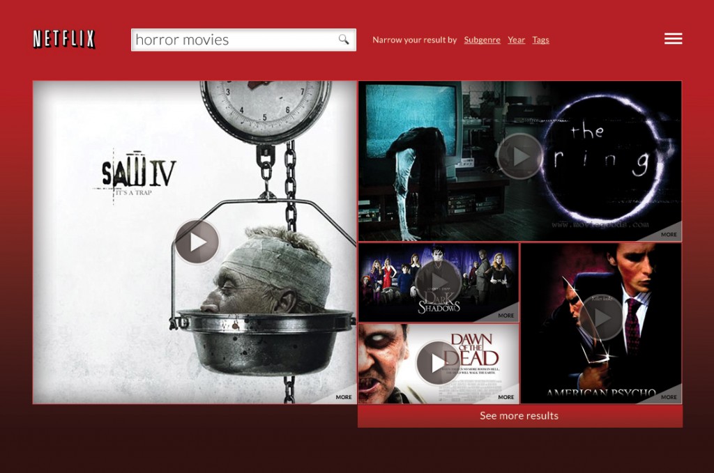
And this is the result:
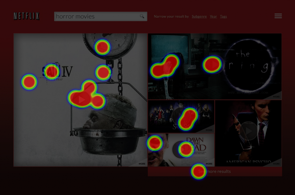
As we see, the spiral still works – but not as distinct as test number one. But the power of human eyes draws our attention, I guess. So using images as the search results can give us challenges.
Still. Espen Klem’s myth: Confirmed!

