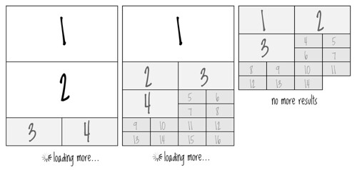
How to visualize absolute search result quality
Earlier, I’ve looked into how I could use the Phi spiral to possibly get a better display of what’s most relevant in a search result. A former colleague of mine, Johannes Hoff Holmedahl, did a quick test on the theory, and it may actually work.
For the recipe app I want to do something slightly different, showing the absolute search result quality for each result. In other words: If the best search result in a result set is not very good, make it smaller than if it has higher value, thus showing an absolute value for each result. The dialogue equivalent comparing i.e. two movies would be to define the best of them better than the other, but not the best you’d seen.
Absolute search result quality
aka. Absolute visual relevance hierarchy
How do we then measure absolute quality? In an earlier post I described what would be our relevancy hierarchy. The more in-season ingredients in a recipe, the better quality.
I’ve defined three quality groups for absolute search result quality so far (number of ingredients: n):
- n >= 4
- 1 < n < 4
- n = 1
Here are three different examples on search results set. First has two results with four or more in-season ingredients and second has only one. Third has none, typically something that would happen during the winter months in Norway:
The recipe app is work in progress. Check back every now and then for new blog posts on the subject.

