Visual relevancy hierarchy creating a better search result using the Phi spiral?
Today, most search solutions will give you the results as a list from 1 to 10. Problem is, they’re not very appealing, and don’t do the task at hand very well. At the top of the list, it’s okay. Number 1 gets most clicks, number 2 a little less, number three even less, but then in the middle, a lot of results get less than the ones at the bottom.
Using the phi-spiral as a visual relevancy hierarchy
A search engine list out what it thinks is the most important first. But the list has several issues:
- You could, but should you?
Just because your template really want you to render a logic list as a visual list, doesn’t mean you have to do it like that. - Not representing the information well
A news article looks like a news article, no matter which version you see: The front page teaser, a short version or the full blown thingy. But a search result almost always looks like just that: A dull list of items. - Too many items
Results at the bottom of the list tends to get higher click rates than just above the bottom. I guess this have to do with how people scan web content in F-shaped patterns and that a list of 10 items is too much information for the user to digest.
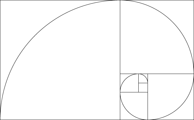
So, what if we started to use space and position to show relevancy? The Phi spiral, building on the Fibonacci sequence would make a nice search result.
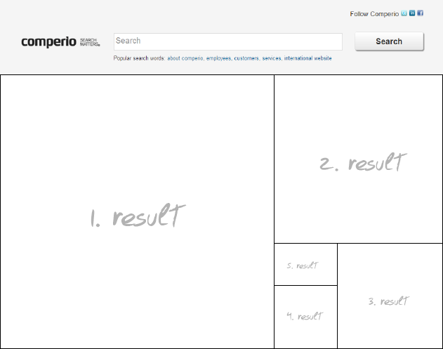
Phi spiral as a search result. We’ll get all sorts of other issues, but I think it’s a good start to getting somewhere better.
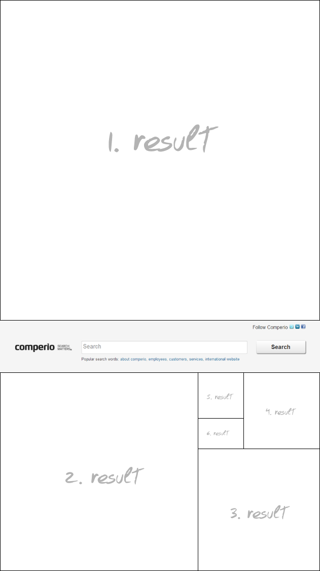
You would maybe not be able to show more than 5 result items, but we could put the search box in the middle of the page and then get 6 items.
So, what do you think? Others are using treemaps: Newsmap.jp. Not a very usable implementation, but a nice idea.





[...] uke skrev min kollega, Espen Klem, et blogginnlegg om å bruke Phi-spiralen for å designe bedre søkeresultater. Jeg tenkte jeg skulle prøve ut teoriene hans. Min kollegas [...]