Search without search box: Recipe App – Alpha version
First thing first: I really like search as a technology. Not so much because how it helps us today, but how it can help us tomorrow. Especially on the UX front, stuff moves slowly. One of the biggest issues, in my mind, is the empty search box. That’s why I tend to look for solutions where you have search without search box, or functions and tools that extends the search box.

The empty search box by Google
The problem with an empty search box
So, what’s the biggest problem with the empty search box? In my mind it doesn’t give a hint about what’s the possible outcome of asking a question to the search engine. Think about these five questions being different search boxes:
- Soooo…?
- What would you like?
- What would you like for desert?
- Do you like ice cream for desert?
- Do you like pistachio ice cream for desert?
The first question is the most open ended, and is the equivalent of the empty search box in a general search engine. The one with all of the worlds knowledge at hand. Second one hints that the answers of your request lies within your likings. Third, the questions get semi-concrete, and fourth and fifth, you’re asked a yes/no-question.
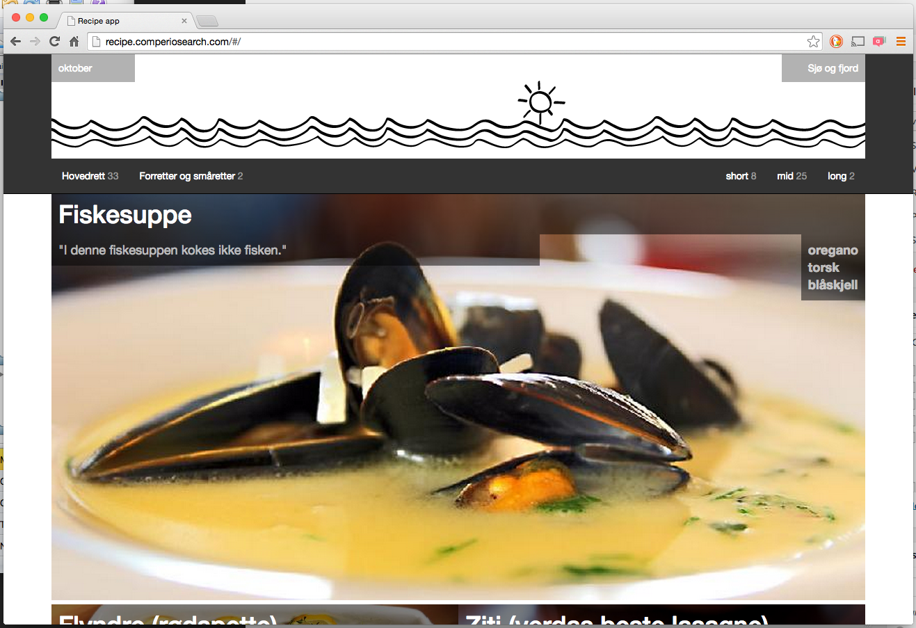
A search without search box working quite well
The recipe app asks you if you like any of these recipes based on two variables (time of year + place you harvest the food). We know the date and make an assumption about place and tell you that we’ve chosen these variables. Then we give you a couple of extra variables to play with to refine the search a bit more.
So far, the content seems to trigger peoples imagination and the swipe interaction is easy enough to do many times, although not very well communicated so far. When I normally give people a working search prototype, they do 2 – 5 search queries. Now I see between 5 – 15. That’s great stuff, and maybe a search without search box is actually a good idea?
Known bugs and weaknesses
- URL stays the same
No way of sharing a specific search (month+place+filters) - Buggy visual relevance
For desktop and pad, all recipes with match on three ingredients or more should have full width result view. - Not all recipes indexed
HTML for the recipes has changed. We didn’t have time to figure out all the new characteristics of the new HTML, so a lot of recipes were not indexed. - Visual snag on time navigator
When selecting “short”, “medium” or “long” time to prepare recipe it should collapse as with the type navigator. - Swipe hangs every now and then
The swipe library is either not tuned perfectly or a little fragile. Easy to get into a state where it stops working. - All ingredients equally important
“Oregano” and “Chicken wings” equally important. That results in some not-so-desired search results. - Google Analytics and single page app not fixed
We log one pageview per user since it’s a single page app. With a rewriting of the URL this can be easily fixed. - Design and UX
It’s just a makeshift design to communicate the idea. It should better explain interaction and season+place.
Any comments? We’d love to get your input! Check out the solution, the actual recipe app, or you can check out the other blog posts about the Recipe App. There’s a lot of both search domain-, tech- and UX-stuff.


