User-friendly design in my grocery store
How can you make your search solution easier to use for your users? By trying to understand how they think, and what their challenges are.
Yesterday I went to the store to buy oregano and pizza seasoning mix, amongst other things. Usually I use two or three hours in front of the seasoning shelves to find what I am looking for (at least). But yesterday I found what I was searching for in two or three seconds.
Why? Because the designer of the seasoning labels was smart enough to think about how I search for the right product, instead of just making something beautiful.
This is what the shelves looked like:
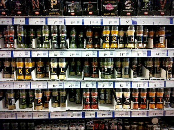
All the seasoning labels were marked with a letter: the first letter in the name of the seasoning. And luckily for me the store employees had put them in an alphabetical order, so I in matter of seconds found what I was looking for.
Happy from experiencing a user-friendly design solution in my everyday life, I headed out to my Toyota Avensis with my groceries. And there, in the driver seat, trying to change my CD to the next song, I concluded that not all designers think about the users need:
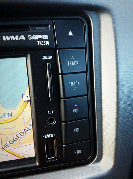
What button do you press to change to the next song?
Make your search solution easier to use for your users! Try to understand how they think, and what their challenges are …





I Toyota Avensis så har du jo knappene for å skifte sang på cd direkte på rattet, så de har vell tenkt på brukerens behov?
Fortsatt greit å kunne skifte sang ved LCD-skjermen. Og litt irriterende om kona i passasjersetet lener seg over og skifter låt på rattet :-)
Kanskje de har tenkt på brukeren uten å brukerteste det? Ville du trykket opp eller ned for neste låt?
My guess would be down arrow. The car is manufactured/designed in Japan. Japanese read many thing from top to bottom. So down arrow would be our (western language reader/writers) right.