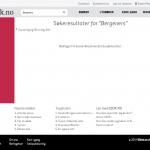
Search: better user experience with one line of JavaScript
What’s the cheapest trick you can do to get a better user experience on your search solution, and make your users do better search queries?

Add a small line of JavaScript in your template’s document ready function:
|
1 |
$("#MySearchBox").focus(); |
This will do two things for the user:
- It’ll be easier to see the search box .
- The user can start typing without having to click inside the search box.
Next issue is that most intranet and websites are more than just a search solution. Maybe you don’t want that much attention on the search box on your homepage. The solution is then to do this on your search result page.
This will make it easier for your users to enhance their search query when they’re not happy with the search result at hand.
Do you have any other examples on other quick fixes that could make an even better user experience for your search solution?


