Great design vs. usability
What is more important: Great design or usability? I’m just kidding! They’re both equally important, and can easily be combined.
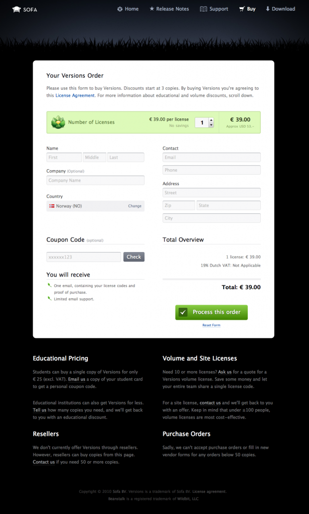
A few days ago, my trial of the SVN-software Versions expired, and I decided to buy a full version license. When I came to the order form, I was really impressed. The design gave a really good first impression, actually so good that I had to take a screenshot of it:
I’m not used to experience order forms, that actually looks quite sexy. I though that this was a form I wanted to share on my blog.
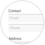 But then – I started filling in the form … The design was still really nice, but the form had a few quirky features:
- Under “Contact”, they wanted me to type my Email and Phone. But when I tabbed my self into the input box, I had forgotten what it said, and I had to tab to the next field to find out what they had wanted me to write in the previous one.
- I also didn’t know where in the process I was, whether I was in step 1 of 100 (if that was the case, I would cancel) or if this was the only step, and that I would order by clicking the “Process this order”-button.
These two “usability bugs” would easily be revealed by implementing a user test.
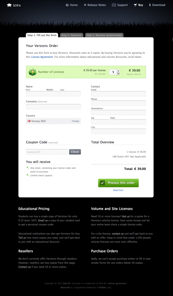
After a test, I guess it would have looked something like this:
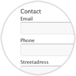 User friendly, but still good looking. Amazing!
- I have put name of the input boxes above every box. They can still group two or more fields under the title “Contact” if they want, but now I don’t have to refresh my form to find out what the field is for.
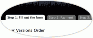 I have also added three tabs at the top of the form, which tells you that you are in step 1 of 3. Easy, and helpful.
On the Internet, designing a pretty page isn’t enough. The web is used not as a pretty object, but as a problem solver. That’s why we have to test our design as well, because we don’t always know what your audience thinks!
This post has a terrible title: “Great design vs. usability”. They (design and usability) shouldn’t fight at all!
Great design + Usability = <3 Together forever, hand in hand.
Do you know any websites with great design – but bad usability?

